
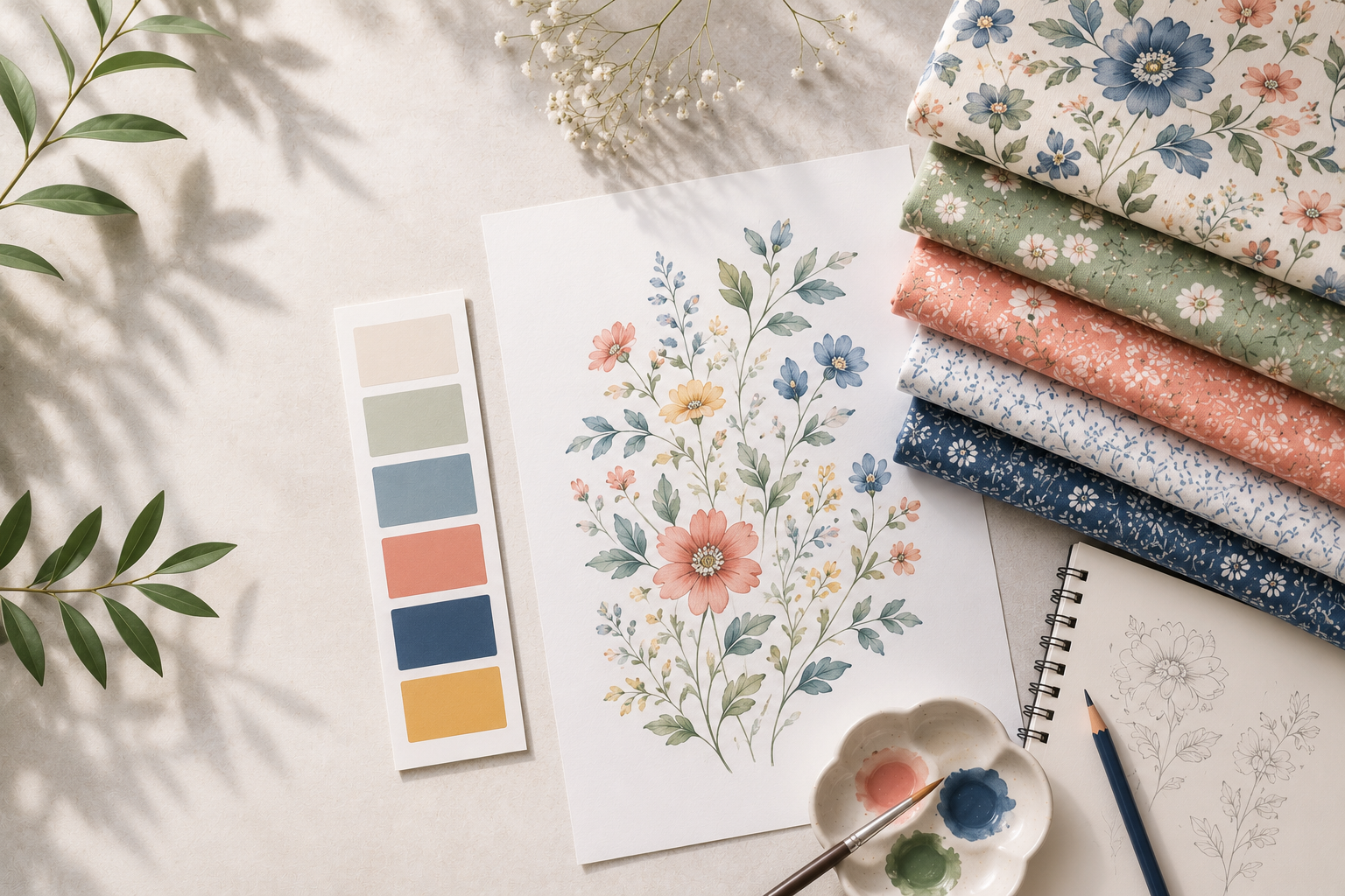
Why great textile print design is more than beautiful artwork
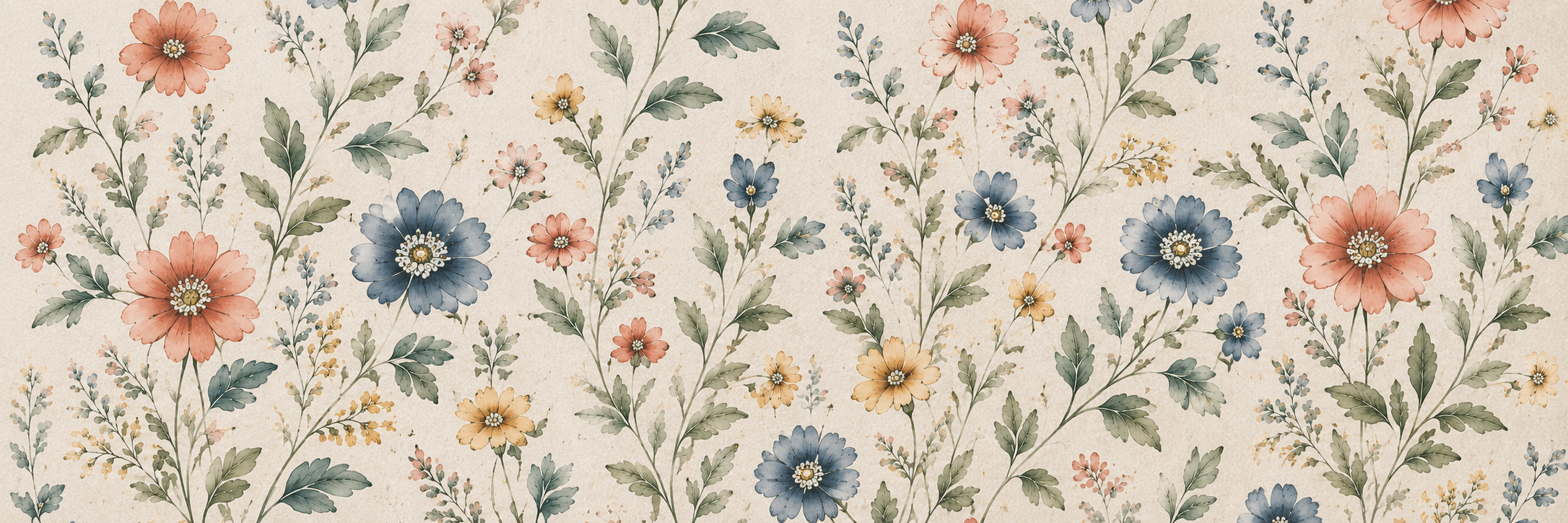
When people think about textile print design, they often focus on what they see first—the colours, the motifs, or the overall visual appeal. While these elements are certainly important, they only tell part of the story.
Behind every successful textile print is a carefully considered design process that balances creativity with strategy. A print isn’t simply created to look beautiful on a screen; it’s designed to work on fabric, support a product, fit within a collection, and ultimately appeal to the people who will buy it.
Whether it’s a fashion collection, home furnishing range, or lifestyle product, great textile prints are rarely accidental. Every motif, colour choice, repeat, and scale is guided by purpose.
As a textile designer, I’ve found that the strongest collections aren’t always the ones with the most intricate artwork. They’re the ones where every design decision supports a clear vision while remaining commercially relevant.
In this guide, I’ll share eight fundamental principles that I believe every successful textile print follows. Whether you’re a fashion brand looking to develop original prints or someone interested in understanding the design process, these principles offer a practical framework for creating prints that are not only visually appealing but also commercially successful.
1. Every strong textile print starts with purpose
One of the biggest misconceptions about textile print design is that it starts with drawing.
In reality, it starts much earlier-with asking the right questions.
Before opening Illustrator or picking up a pencil, I first want to understand why I’m creating the print. Every successful collection begins with a purpose, and that purpose influences every creative decision that follows.
Some of the questions I typically ask are:
- Who is the target customer?
- Which season is the collection designed for?
- Is the print meant for apparel, home furnishings, or accessories?
- What emotion should the collection evoke?
- Does the brand have an existing visual identity that needs to be considered?
Answering these questions provides direction before any artwork is created.
For example, a resort wear collection designed for a contemporary fashion label will require a very different design language than a children’s bedding collection. Although both may feature floral motifs, the scale, colour palette, composition, and overall mood will naturally differ because the purpose behind each collection is different.
This initial stage often includes trend research, moodboarding, fabric references, lifestyle imagery, colour inspiration, and competitor analysis. Rather than searching for ideas to copy, the goal is to understand the visual direction of the market while identifying opportunities to create something original.
A clear concept acts as the foundation of every collection. It ensures that each print feels connected rather than existing as an individual piece of artwork.
Instead of designing random motifs, successful textile print design tells one cohesive story.
Imagine a collection inspired by Mediterranean summers.
The colour palette may include warm terracotta, soft olive greens, sandy neutrals, and faded blues. Motifs might include citrus branches, hand-painted ceramics, coastal florals, and organic stripes. Even if every print looks different, they all belong to the same visual narrative.
Without a clear concept, collections often feel disconnected. Individual prints may be attractive on their own, but they struggle to work together commercially.
A useful question I always ask while reviewing a collection is:
If I removed the collection title, would someone still understand the story through the prints alone?
If the answer is yes, the concept is strong.
Purpose doesn’t restrict creativity—it gives creativity direction.
2. Create motifs that can build a collection, not just one print
Beautiful illustrations don’t automatically become successful textile prints.
One illustration may create a beautiful standalone design, but commercial collections require flexibility. That’s why I think about motifs not as individual artworks, but as building blocks that can evolve into an entire collection.
Every motif should have the potential to be adapted, simplified, combined, recoloured, or repeated in different ways.
For example, imagine drawing a botanical flower.
Rather than using it once in a single all-over print, I might explore several possibilities:
- A detailed hero motif for the main print.
- A simplified line drawing for a coordinate design.
- Individual petals transformed into small filler elements.
- Leaves used independently to create a secondary print.
- Tiny floral sprigs developed into an all-over ditsy pattern.
- A textured background inspired by the original illustration.
By extracting multiple design elements from a single motif, it’s possible to create an entire family of prints that feels cohesive while offering enough variety for merchandising.
This approach is particularly valuable when developing collections for fashion or home furnishing brands. Buyers are rarely looking for one beautiful print. They’re looking for a coordinated group of designs that work together across different products.
A well-balanced collection often includes several motif categories:
Hero motifs
These are the focal elements that define the collection. They tend to be larger, more detailed, and visually striking.
Secondary motifs
Supporting elements that complement the hero artwork without competing for attention.
Fillers
Small leaves, berries, dots, or abstract shapes that help create rhythm and improve the overall composition.
Texture elements
Hand-painted brushstrokes, grain, ink effects, or subtle organic marks that add depth and prevent the design from feeling flat.
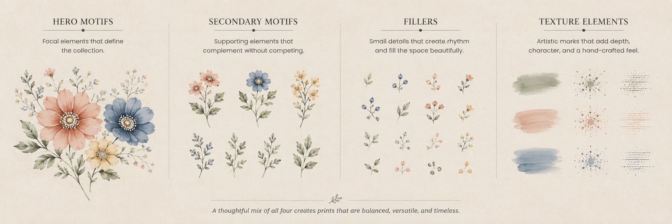
This layered approach creates greater flexibility throughout the collection while maintaining consistency.
It’s also important to consider how motifs behave at different sizes.
A flower that looks beautiful when enlarged may lose its character when reduced for a smaller repeat. Similarly, tiny details that appear crisp on a digital screen may disappear during fabric printing.
Testing motifs at multiple scales early in the design process helps identify these issues before final artwork is prepared.
Another common mistake is trying to include every interesting idea within one print.
Instead, successful collections allow each print to breathe.
Some designs become bold statement pieces, while others intentionally remain subtle so they can support stronger hero prints.
This balance creates a collection that feels thoughtfully curated rather than visually overwhelming.
Ultimately, great textile print design isn’t about creating as many motifs as possible.
It’s about creating versatile motifs that can evolve into a commercially relevant collection while maintaining one consistent visual story.
3. Design repeats that feel natural, not mechanical
One of the defining characteristics of successful textile print design is something many people never consciously notice—the repeat.
A beautifully illustrated motif can instantly lose its appeal if the repeat is poorly constructed. Visible seams, awkward spacing, repetitive clusters, or obvious transitions can make even the most carefully drawn artwork feel amateur.
A great repeat should feel effortless.
When a customer looks at fabric, they shouldn’t immediately notice where one repeat ends and the next begins. Instead, the design should appear as though it continues naturally across an endless length of fabric.
Achieving this level of continuity requires far more than simply duplicating artwork.
It involves carefully considering:
- Motif placement
- Visual rhythm
- Negative space
- Rotation
- Scale variation
- Directional movement
- Balance between dense and open areas
During repeat development, I often create several layout variations before deciding which one works best. Sometimes moving a single motif by just a few millimetres completely changes the overall flow of the print.
This stage requires patience because every adjustment influences how the eye travels across the fabric.
Choosing the right repeat style
Different collections call for different repeat structures.
Some of the most commonly used repeat types include:
Straight repeat
A simple grid where motifs repeat directly above and beside each other.
This works well for geometric patterns and structured layouts.
Half-drop repeat
Every alternate row is shifted vertically by half the repeat.
This creates a softer, more organic flow and is widely used in floral and botanical collections.
Half-brick repeat
Rows shift horizontally, reducing obvious repetition.
Ideal for conversational prints and contemporary layouts.
Tossed repeat
Motifs appear scattered naturally in multiple directions.
Perfect for relaxed, playful designs that avoid rigid structure.
The repeat style should always support the overall concept rather than becoming a decorative decision.
For example, an elegant heritage-inspired collection may benefit from a structured repeat, while a hand-painted botanical collection usually feels more natural in a half-drop arrangement.
Think beyond the repeat tile
One technique I find extremely useful is zooming out.
Rather than reviewing only one repeat tile, I preview the artwork across a much larger surface.
Viewing multiple repeats together immediately reveals problems such as:
- accidental lines
- empty gaps
- repetitive clusters
- directional bias
- distracting visual paths
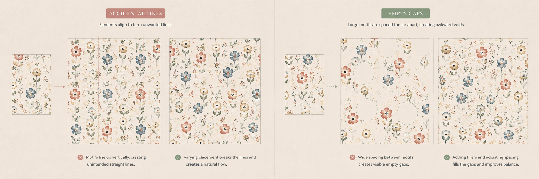
These issues often remain invisible when looking at only one repeat square.
Ultimately, the repeat should disappear.
Not because it isn’t there, but because it works so seamlessly that viewers experience the pattern rather than noticing its construction.
4. Build a colour story, not just a colour palette
Colour is often the first thing people notice in a textile print.
Before they recognise individual motifs or appreciate the composition, they respond emotionally to colour.
This immediate emotional response is why colour selection deserves as much attention as the artwork itself.
Many beginner designers choose colours based simply on personal preference.
Professional textile print design, however, takes a much more strategic approach.
Instead of asking,
“Which colours look nice together?”
the more important question becomes,
“What should this collection communicate?”
Every collection has a mood.
Some feel calm and understated.
Others feel energetic, playful, luxurious, nostalgic, or contemporary.
Colour is what establishes that emotional direction.
Think in stories, not swatches
Rather than selecting isolated colours, I prefer building a complete colour story.
A colour story usually includes:
- Hero colours
- Supporting colours
- Neutrals
- Accent shades
- Dark grounding tones
- Light balancing tones
Together, these create harmony across every print within the collection.
For example, imagine designing a collection inspired by an early autumn botanical garden.
Instead of randomly selecting greens and browns, the palette might include:
- Olive green
- Sage
- Warm terracotta
- Soft ochre
- Dusty blush
- Cream
- Deep charcoal
Every colour contributes to the overall atmosphere.
Even when individual prints look different, they still feel like part of the same collection because the colour language remains consistent.
Colour should support the brand
When designing for clients, colour decisions should never exist in isolation.
Different brands have different identities.
A premium luxury label may favour muted, sophisticated tones.
A children’s brand may require brighter, playful colours.
A home furnishing company may prioritise timeless neutrals that work across multiple interiors.
Understanding the customer is just as important as understanding colour theory.
Plan for multiple colourways
Another advantage of developing a strong colour story is flexibility.
Many successful textile prints are released in several colourways.
One floral print, for example, might appear as:
- A soft pastel version for Spring/Summer.
- A richer jewel-toned version for Autumn/Winter.
- A neutral monochrome version for contemporary interiors.
Designing with recolouring in mind significantly increases the commercial value of a collection.
Rather than creating one beautiful print, you’re creating multiple opportunities for the same artwork to succeed in different markets.
5. Balance hero prints with supporting prints
One of the most common mistakes I see in developing collections is trying to make every print the star.
When every design demands attention, the collection begins to compete with itself.
Successful collections rely on hierarchy.
Just as a conversation needs moments of emphasis and moments of pause, a print collection benefits from variation.
That’s why commercial collections typically include a mixture of different print types.
Hero prints
These are the statement designs.
They attract attention immediately and often become the visual identity of the collection.
Hero prints usually feature:
- Larger motifs
- Richer detail
- Stronger compositions
- Greater visual impact
These are often used for dresses, statement cushions, bedding, feature walls, or signature products.
Coordinate prints
Coordinate prints support the hero designs.
They are intentionally simpler but remain connected through motifs, colour, or theme.
Examples include:
- simplified florals
- leaves
- tiny ditsy prints
- subtle stripes
- geometric textures
Coordinates provide balance and allow brands to merchandise complete ranges rather than relying on one dominant design.
Blender prints
These are the quietest members of the collection.
Often consisting of subtle textures or tiny repeating elements, blender prints create visual breathing space while tying the collection together.
Although they receive less attention individually, they are often essential for building commercially successful ranges.
Why this matters commercially
Imagine walking into a fashion store where every garment featured oversized, bold floral prints.
Even if each print were beautiful, the overall collection would quickly feel overwhelming.
Now imagine a collection that combines:
- One hero floral.
- One coordinate leaf print.
- One textured stripe.
- One subtle botanical.
- One neutral blender.
Together, these designs create variety while maintaining cohesion.
This gives buyers greater flexibility when planning assortments and allows customers to mix products more naturally.
Design the collection before designing the individual print
One shift that significantly improved my own design process was thinking about the collection first.
Rather than asking,
“How can I make this print better?”
I began asking,
“How does this print strengthen the collection?”
That small change completely transformed how I approached textile print design.
Each print no longer had to do everything.
Instead, every design had a specific role.
Some attracted attention.
Few added balance.
Some created texture.
Few supported colour continuity.
Together, they told one cohesive story.
And that’s what makes commercial collections successful.
6. Design for the final product, not just the screen
One of the biggest differences between a student project and commercial textile print design is understanding where the artwork will ultimately live.
A print that looks stunning on a computer screen doesn’t always translate successfully onto fabric.
That’s because textile design doesn’t end with creating artwork. It continues through production, printing, garment construction, and finally, the customer’s experience.
Before finalising a print, I always ask:
- Where will this print be used?
- How large will it appear?
- What printing method will be used?
- Which fabric will carry the design?
- Will the details remain visible after printing?
These questions influence many design decisions.
For example, a highly detailed botanical illustration might reproduce beautifully on a digital print for silk scarves, but some of those delicate details may become less distinct when printed on textured cotton or through certain industrial printing processes.
Similarly, very small motifs can disappear when viewed from a distance, while oversized motifs may lose impact on smaller products.
Product category changes everything
The same artwork behaves differently across different products.
A print designed for:
- women’s apparel,
- kidswear,
- bedding,
- upholstery,
- table linen,
- or accessories,
will all require different considerations for scale, repeat, and visual density.
A cushion cover allows for bold statement prints.
A shirt may require a softer repeat that complements garment construction.
Bedsheets often benefit from larger repeats that remain visually interesting across a broad surface.
This is why I believe good textile print design isn’t just about creating beautiful artwork—it’s about designing artwork that performs well in its intended application.
Commercial brands value designers who understand both creativity and practicality.
The more production-aware your designs are, the fewer revisions are needed later in the development process.
7. Leave room for trends without losing originality
Every season introduces new colour directions, themes, and consumer preferences.
Trend forecasting plays an important role in textile design because it helps brands stay relevant in an ever-changing market.
However, following trends too closely can quickly make a collection feel predictable.
The goal isn’t to copy trends.
The goal is to understand why certain visual directions are emerging and interpret them through your own creative perspective.
When researching trends, I look beyond the finished products.
Instead, I explore:
- nature,
- architecture,
- travel,
- handcrafted techniques,
- interiors,
- historical references,
- materials,
- and everyday observations.
These sources often provide far more original inspiration than simply browsing social media or existing collections.
Trends should guide, not dictate
Imagine that soft watercolour florals become a seasonal trend.
Instead of recreating what already exists, ask:
- Can I reinterpret florals through a different artistic style?
- Can I combine botanical motifs with geometric structures?
- Can I simplify traditional floral forms into contemporary line drawings?
Originality often comes from combining familiar ideas in unexpected ways.
Brands appreciate collections that feel current while still maintaining a distinctive point of view.
That’s what creates long-term value.
8. Think like a brand, not just a designer
Perhaps the most valuable lesson I’ve learned through textile print design is that successful collections aren’t created solely for designers.
They’re created for brands.
And ultimately, for customers.
This shift in perspective changes everything.
Rather than asking,
“Do I like this print?”
I ask,
“Will this print solve a problem for the brand?”
Every design decision should support the larger collection.
Consider questions like:
- Does this print fit the brand’s handwriting?
- Does it appeal to the target customer?
- Can it be developed into multiple products?
- Does it work alongside the other prints in the collection?
- Is it commercially relevant for the intended season?
Thinking like a brand doesn’t limit creativity.
Instead, it gives creativity a purpose.
Fashion brands and home furnishing companies rarely purchase isolated artwork.
They’re investing in collections that support merchandising, storytelling, and product development.
Designers who understand these commercial objectives become valuable creative partners rather than simply artwork suppliers.
That mindset has influenced the way I approach every collection I create.
Instead of designing individual prints, I focus on designing complete visual stories.
Bringing it all together
Great textile print design isn’t defined by one beautiful illustration.
It’s the result of many thoughtful decisions working together.
From the initial concept and motif development to repeat construction, colour planning, scale, and commercial application, every stage contributes to the final outcome.
The strongest collections don’t try to impress through complexity alone.
They communicate a clear story, balance creativity with functionality, and respect production requirements.
And most importantly, they create products that people genuinely want to own.
Whether you’re building a fashion collection, developing home textiles, or searching for original print designs for your brand, these principles provide a strong foundation for creating work that is both visually engaging and commercially meaningful.
Textile print design is never just about decoration.
It’s about creating patterns that connect with people while helping brands tell their own stories.
Explore my textile print portfolio
If you’re interested in seeing how these principles translate into real design projects, I invite you to explore my portfolio.
There you’ll find original textile print collections, repeat developments, and concept-led designs created for fashion and home furnishing applications.
If you’re looking for a textile designer to develop commercially relevant print collections for your brand, I’d be happy to discuss your project.
Frequently Asked Questions
Textile print design is the process of creating artwork that can be printed onto fabric. It includes concept development, motif creation, repeat construction, colour planning, and preparing artwork for production across fashion, home furnishings, and lifestyle products.
A successful commercial textile print combines originality with functionality. It has a strong concept, balanced motifs, seamless repeats, a cohesive colour story, appropriate scale, and aligns with the target market and product category.
Repeat patterns allow a design to flow seamlessly across fabric without visible joins. A well-constructed repeat creates visual continuity and improves the overall quality of the final printed textile.
Most collections begin with research and concept development, followed by moodboards, motif exploration, colour planning, repeat development, and the creation of hero and coordinate prints that work together as one cohesive collection.
Yes, but it often requires adjustments to scale, colour, or repeat. A print designed for apparel may need modifications before being applied to bedding, upholstery, or accessories to ensure it performs well in each application.